Seems like I'm starting a series in which I've read a book on a topic and then act as if I know everything there is to know about it and I can explain it in layman's terms to others. In fact, for this second instalment, I've not even read the whole book yet, I'm just half-way through What Are You Looking At? (150 Years of Modern Art in the Blink of an Eye) by Will Gompertz.
What I'll talk about are those modern art paintings which don't look like anything except a bunch of squiggles, shapes and lines, which you look at and think "What the hell does this even mean?" or "My child drew something similar. Why isn't that art?!" The way I'll explain the subject is to go through an example, rather than talk about various paintings or styles in general.
The painting I chose to focus on is Composition C (No. III) with Red, Yellow and Blue by Dutch artist Piet Mondrian, which from now on I'll refer to simply as Composition C. It's well known throughout the world and the style is instantly recognizable (Yves Saint Laurent even designed a collection of clothes around it). It's probably even appreciated by common people, while at the same time it's so simple that you could very accurately recreate it in Paint.
 with Red, Yellow and Blue")
To get to an understanding of this painting, we shall embark on a journey of abstraction, much like the dutchman did until he developed this unique style involving only black vertical or horizontal lines and rectangles or squares filled using only the three primary colours: red, yellow and blue.
Take whatever you like with you - your imagination, an open mind, a bottle of hard liquor, your favourite hallucinogen - but the most important thing you need is what I will explain next.
Before we depart
What does "abstract" even mean? For our purposes it can be used either as a verb or an adjective. Its etymological roots - abs meaning "away" and traho meaning "to pull" - suggest the idea of pulling something away from something else. In common usage, the verb "to abstract" means to "consider something in a general way or make a general judgement after looking at particular details. Or, as I would say it, to look at something and pull away the important part, while disregarding the details.
As an adjective, "abstract" marks something as being immaterial, such as a thought, a concept, an idea, a feeling, a quality.
All aboard!
That's the theory. Understanding it in practice is the whole goal of our voyage. We will take something concrete and repeatedly abstract it to see what happens.
For this, I have chosen a reference from the adventure video game Return to Monkey Island. (Mild spoilers ahead!) In it, at some point you have to join a society of fishermen who specialize in telling wild stories of their adventures. To do that, you must learn how to tell a good story from other members of this community. The gist of it is that a good story has rich depictions, often exaggerated, in order to amaze the listeners. This is the story I got:
All of a sudden, my ship was swallowed by a huge lunker of a whale, a real chum-chomping line-breaker if ever there was one. Inside it was like walking on soft cheese, with rivers of pea soup that stank like a landlubber's bait box. One false move and you'd be wearing Jonah's overcoat, a layer of greasy phlegm as thick as day-old pancake batter. And then we escaped. Through the digestive system. Ship and all.
Wow! Quite the story, isn't it?
The first things to be thrown overboard
How do we proceed in abstracting it? To pull away what is important we must first identify what is the important thing that the text is relating, and what are details. Clearly, there are a lot of descriptive words in there, and we don't need as many to inform the reader that the whale was big or that there was an awful smell inside. Maybe have a try yourself at removing the cruft before reading on. This is what I came up with:
Suddenly, my ship was swallowed by a huge whale. Inside it, the floor was soft and slimy, and it stank. One false move and you'd be covered in grease. And then we escaped. Through the digestive system. Ship and all.
Much shorter, isn't it? Before we go on, think a bit: if you were the author, why would you use one of the texts instead of the other? What would be your intention if you chose to go with the original, and what would be your intention if you went with the modified version?
In the original text, the intention is clearly to offer the reader a sense of what it would be like to actually be swallowed by a whale. The very detailed descriptions emphasize the size of the whale, the greasiness of its insides, the awful smell. The selection of certain words and phrases has the goal of gripping the reader and amazing them. Comparisons give several reference points which they can use to recreate the experience themselves, through visual, olfactory and tactile cues. You may not know what "Jonah's overcoat" is, but you probably have an idea of what pea soup smells like.
On the other hand, the second text focuses more on pointing out the important bits: what happened, what it was like, what were the dangers and the discomforts of being inside the whale. It's not trying to persuade you to imagine what it's like being swallowed by a whale, but to understand the predicament that the narrator was in, that the crew of the ship were in a bad place.
You notice that the reference points are gone. It's no longer the smell of a "landlubber's bait box", it just "stank". This means that it's not important from the author's point of view that the audience identify the smell accurately, it's more important to acknowledge that there was an unpleasant smell.
Stinking is an abstraction of all the foul smells that exist or that one can imagine. If they want, the reader is free to substitute the stench with any unpleasant smell they want. It can be rancid, it can be disgusting, it can be stingy. These are all details. Stench is a concept which "pulls away" the essential idea of a foul smell, leaving behind these details.
Streamlined design
To further abstract the story, we must now look at our modified text and ask what is important in this version, and what are just details. To me, it feels that what's important is what happened, while the descriptive words and phrases are just decorations. My reasoning is that if we were to change these the story would remain the same. For example, if we say that the inside was actually perfumy and not slippery and greasy, but sticky, it wouldn't make much difference, would it. But if instead of being swallowed, the ship caught fire, or if we were on an airplane instead of a ship, or that we didn't escape, that would be a whole other story.
My ship was swallowed by a whale. It was awful inside it. And then we escaped.
Wow! Not much of a story now, is it? You'll notice that the middle sentence doesn't relate an event, it's still a description. I could have removed it, too, but I think it's important to keep it in, to tie the beginning and the end, and to keep the idea that it was a dangerous situation. Also, notice that by using the word "awful" I've synthesised the details of a soft and slippery floor and a repugnant smell into a single concept. We've looked at the particular details and made a general judgement, which, as you may remember from the beginning, is the definition of abstraction.
What would be the author's intention in this case? I would say it wouldn't be an artistic one. There's not much to grasp the audience. Sure, being swallowed by a whale is an extraordinary event, but the details are left as an exercise to the reader. The goal of this text is simply to convey information. You'd write like this if you just wanted to make a list of what happened, like a logbook.
Turbulence ahead
You'd think this is it. You can't simplify this anymore, without losing the essence. But at anything we look, there is something that is core, and things that are details which can be disregarded. It also matters how we look at it. That would be the context in which we think about something. Until now we thought only about this particular story, about being swallowed by a whale and escaping. What we could do, is look at the key elements of the story and see if we can generalize (aka abstract) those. Let's take the ship, the whale, the adjective "awful" and the idea of escaping and think how we can do that. I'll give it my best shot. See if you can do it.
My vessel was swallowed by a creature. It was inconvenient inside it. And then we persevered.
You're probably asking: why would someone even speak or write like this? This is now conveying so little information, that the recipient would just gaze blankly at you wondering what exactly is it that you are trying to tell them. They would have a hard time imagining what's even going on. Ok. You were swallowed. But it was inconvenient? How? Is it inconvenient like an itch, or like having poisonous gases eating your skin? The poor reader would be lost. They wouldn't know whether to feel shocked by your predicament or laugh at it as a smarmy anecdote.
At this point a tension arises between the author and audience. Up until now, the author expressed something directly, and the reader took it as is. But now it seems like the author is hiding something. They're not telling everything, and the reader is left confused wondering what and why. It seems as if they are asked to fill in the details themselves.
This confusion exists because the reader is looking at it wrongly. Even if there is less information conveyed than the previous version, you probably have an intuition that there is some unpalpable quality in this phrasing.
The thing is that by looking at this text and going the other way, trying to particularize the elements, you would get another interesting story, which would be different than the initial one, but would still capture the essence. For example, you could have a story about a spaceship which was swallowed by a creature as huge as a planet. Inside it there would be different, amazing dangers, like radiation and boiling plasma, and finally you'd find a way to blow a hole in this creature and escape. You can easily imagine that this would trigger different images in your mind and different feelings even, compared to the whale story, even though, essentially, it would be the same story.
That's how many books and movies are made. One of the best examples is Star Wars, which takes the essence of various myths, narative and visual elements from several movies from the golden age of cinema, and expands them into a space opera.
OK. So what? We went up the ladder of abstraction, just so that we can go down another way? You are right, that was a slight detour. Here is what an artist really wants to convey when they phrase things in such a manner. But first, I want to take it a half step further:
My vessel was engulfed by an entity. It was inconvenient inside it. And then we persevered.
As I said, it's wrong to look at this as conveying some sort of information directly. The author's intention is not to inform you of anything, but to point out the structure and relations. That's why he uses concepts that are so abstract. Because it's not important what they are, it's how they relate to each other. It would be foolish of you to try to figure out what exactly was inconvenient. If the author wanted you to know that, they would have said it directly: "It stank like an athlete's worn socks!" Instead, you should think of inconvenience in general, and persevering over that state.
What the artist would want you to think about, is that all such predicaments are the same. Being engulfed by a huge whale and escaping, is the same as having an itch and overcoming it, and it is the same as, say, being overwhelmed by anxiety and dealing with it. Now that does say something, doesn't it? Something much more powerful and deep than what we've dealt with up until now.
Sure, you could say that because of this reasoning, it means that all stories that conform to this structure basically say the same thing. Even the whale story could be a metaphor for dealing with inconvenience, for example. Yes, it could be, but that metaphor would be buried, hidden by all the images of slimy bait, soft cheese, pea soup and grease overcoats. Your focus would be on that image, and not so much, maybe not at all, on that deeper message.
OK. But if that is the message - that all external inconveniences are the same - why not just say it like that, or as I explained it two paragraphs ago? For one thing, it would be kind of less magical, less artistic. But that's a fair point. Another reason would be that if you try to explain it with a few examples, it's a more restricted message. You've taken something very generic and particularized it. Maybe the examples you chose are alien to your audience. They haven't experienced something similar. They can't relate. But if you only offer them a pattern, they can use that to identify one of their own experiences which fits the pattern, and trigger emotions that are much more personal. In fact, that's exactly what I did when I produced the examples of an itch and dealing with anxiety. I looked through my experience for those that fit the text and chose a couple. A different person might have picked different examples.
The artist's job is to just offer their audience this new perspective, emphasizing the essence of their experience and revealing its place in the bigger spectrum of human experiences.
A thousand words for those colourful rectangles
And finally, here is a different reason. With words you can pretty much explain whatever you want, like I'm doing right now. But what if you are a painter? How would you make a painting that is equivalent to the last text? The whale story is relatively easy to portray to a skilled artist. So would the spaceship one. They are easy because they only involve concrete things which anyone can visualize. Even anxiety is not that hard - everybody knows Edvard Munch's Scream, although in this case the artist has to resort to symbols and metaphors, hoping that the viewer would catch the allusion. But when you want to convey something more general, there is an impediment.
How do you portray being engulfed in a general way? How do you portray inconvenience, perseverance? The problem is that these are abstract concepts, which have no representation in the real world. The painter can't just paint three examples of a concept on the same canvas and suggest there is a relation between them. It would look ridiculous. You simply can't draw a whale, a spaceship and Munch's screaming face, to portray "entity".
In speech, we've created words so that we can refer to such concepts without having to always resort to examples. The word "inconvenience" was created to embody the essence of things like an itch, a pain, a negative emotion, so that you don't have to say "that unwanted quality of things like an itch, a pain or a negative emotion". In spoken language defining words for abstract concepts is a natural thing that we don't give much thought to. But in the language of painting that's something else.
We have some presumptions that since painting and graphic arts in general are visual, they have to represent something that we see in the real world. Our eyes can't just, out of the blue (oh, look, a pun!), create some imaginary picture which would have only a slight connection to reality. They can only create pictures based on the photons that they receive from the world.
But that is not the case for an artist. And this is where abstract artists come in. They considered that they shouldn't be limited to just recreating what they see. If you want to convey something more conceptual, you have to do new things. Just like in verbal language we created words for abstract concepts, so did they in the visual language. They had to use their imagination and the "words" at their disposal - lines, shapes, colour, spatial arrangements, tone, brightness, contrast and so on - to create new "words", new elements, more abstract, through which to convey new messages.
Let's consider the text again:
My vessel was engulfed by an entity. It was inconvenient inside it. And then we persevered.
If you were an artist, ignoring that you don't have the necessary knowledge or skill, how would you portray this visually?
I'll give it a shot. Given that we're already exposed to abstract art, it should be easier than the job of the first abstract artists, who had to start fresh and invent all this.
I can imagine our entity would be a big circle encompassing almost the entire canvas. It would be a dark colour, something that suggests it's menacing. For "my vessel" I would choose a regular polygon, like a pentagon, to indicate it's something special, artificial perhaps, not necessarily human-made, but something pertaining to humans. It would be a neutral blue - calm, peaceful, something that doesn't call upon it the attention of any menacing entities. It should also somehow be "engulfed" by the entity. Best I could think of is if the circle had a smaller circle spawning from its surface which contains our "vessel". Next, inside the entity, I'd draw some sharp black triangles to indicate the "inconvenience". Finally, perseverance I would depict as a bright circle that's somehow behind the entity, and there are hints that there is somehow a way to escape the dark entity into the brightness. Here's a naive depiction I did in Paint:
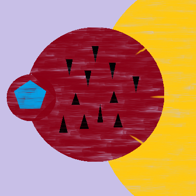
I don't think this will be in a museum any time soon. But, just for fun, here is an image generated using DALL-E by giving it the prompt "An abstract painting depicting the text: My vessel was engulfed by an entity. It was inconvenient inside it. And then we persevered."

The main point of this exercise is that I tried to use the simple elements of the visual language to express something abstract, based on the fact that shapes, colours, textures, size etc. have an implicit meaning to humans, based on evolution. Some are obvious and rational, some are more intuitive. For example, I used yellow to express perseverance, because we tend to see yellow as something happy, since the sun is big and yellow and gives us life and energy. The triangles are menacing because we know from experience that anything pointy is dangerous, or at least uncomfortable.
However, this is still a presumption. I assume that all people understand these elements the same way. It may be mostly true since there are things in life that all humans experience - such as the sun rising every day. But various colours have different meanings in different cultures. Perhaps there are cultures where a dark red is not menacing at all, so for them my creation would not have the meaning I intended.
This was a long stop on our journey. Brace yourself, it's about to get extreme.
Into the whirlpool
How can we abstract the sentence even further? For each element of the sentence, let's think of other things that could go in their place. For example, being engulfed is a specific action. It could be that the vessel was torn apart or pushed away. As general as the word "inconvenient" is, things can also be convenient.
Next, we have to think of new words that express the general meaning of these alternatives. For the action, it's easy: "somebody did something". For the other elements, I found it a bit harder to express. This is what I managed to produce:
Somebody did something to us, making us be in a new state, until we managed to get into another state.
I've conflated everything into a single sentence, using linking words such as "making" and "until", which illustrate the relation between the elements. The words used are so empty of substance, that all you can consider about this construction is just the constituent elements and the relations between them. In fact, this is a lot like grammatical analysis. You have a subject, an action and attributes, and linking words which indicate cause and effect and duration.
Since language becomes quite strained at this level of abstraction, you could revert to using symbols. For example, let's use capital letters for entities, instead of "somebody" or "us". An entity can have a state, and if it does let's indicate that via numbers, so that we can say that the entity is in state 1, or state 2, and so on. When somebody performs an action, we can use ">" between the two entities, so that "A > B" means that A performed an action on B. Then, we can indicate that the action causes the entity's state to transition by using "=>". So, we can more concisely write the above sentence as:
A > B => B1, B > B1 => B2.
If this doesn't make sense, you can read it like this: A acts upon B, causing B to transition to state 1, then B acts upon itself causing itself to transition from state 1 to state 2.
This is so abstract, it's almost unintelligible, but it absolutely depicts the whale story that we started with. Don't believe me? I'll rewrite the sentence replacing the abstractions with more concrete things:
A whale (or even "a huge lunker of a whale, a real chum-chomping line-breaker if ever there was one" if you prefer) swallowed us, causing us to enter a state of great inconvenience, coupled with an awful smell. But in the end we got ourselves inventive and escaped to freedom.
I highlighted with different colours the parts of our construction: A > B => B1, B > B1 => B2. I kept the structure of this abstract phrasing, but you will recognize a strong resemblance to the initial story. The shorthand notation represents the essence of the essence of that story.
So, what's the point? Why are we dealing with this almost incomprehensible scribble? The point is that we've abstracted our story so much, that we can throw away the English dictionary, and constrain ourselves to a handful of terms. It's like a language in itself, one with only a few words. When things are this simple, we can jumble the terms around, try different combinations, invent various scenarios. It's much easier than drafting a whole story upfront.
Let's take a simple example. Looking at the terms we defined and looking at our abstracted story, I start wondering. What if when an entity acts upon itself, nothing happens? And it is only when another entity acts upon it, that it enters a new state?
A > A1 => A1. B > A1 => A2. A > A2 => A2.
I can now try to fill these terms with substance, to try and think of a real story that conforms to a structure. There are three sentences, which I coloured with a different colour each. I'll highlight the textual sentences with the colour that corresponds to the one with the same colour in the symbolic notation.
A guy does nothing all day but play video games, which keeps him happy. However, because he does this, he ignores his friends and soon they stop calling him, so he becomes depressed. He spends more time playing, thinking that makes him happy, but his state does not change, he remains depressed, because what he is doing is meaningless.
I don't want to go down the ladder of abstraction again, but the idea is that you can fill in this new phrasing with your own thoughts. This short notation embodies any such story that anyone can come up with. I have not planned this section upfront, neither the symbolic notation, nor the story. I just picked the first things that came to my mind as I wrote. The point is that I start with a small set of elements and play around with different arrangements and see what I get. In the symbolic notation they might not tell me anything, but if I start expanding them into a story, I might produce something that triggers an image or emotion in a way that's intriguing or revelatory.
However, because the notation is so simple, I might obtain some constructions I wouldn't have otherwise. It's as if I would be writing a whale story, but because I am so focused about the details of peas soup and bait, and I'm trying to portray the stench as accurately as I can, I don't realize I could make the story also be about overcoming inconvenience, which would add some depth to it. Having those details removed, I can see the true essence of the story.
Indeed, using this symbolic notation in written form is not really thrilling, I don't think it moves you in any way. So let's switch to painting again.
What was your story, old traveller?
In the beginning of this article, I said that our journey would be similar to the one Piet Mondrian took in his career. His early works were in the Post-Impressionist style of the time, but gradually his paintings became more and more abstract. You can see this clearly in a series of four paintings spread out over four years, all of which by happenstance portray a tree.

You can notice how with each step he abstracted more and more of the tree. He "pulled away" what he considered the essence and threw away the details. Leaves and branches become lines and curves, until, in the last one, there is barely any resemblance to a real tree.
This is similar to what we did with our whale story, until there were only the bare bones of the story, and then we went even further and there wasn't anything left of it but the structure.
The big leap that Mondrian made was that he went all the way, and rather than just abstract something further, he started the other way around: he started with completely abstract things and created a painting out of those. While in the last picture in the series you can somehow see a tree, or at the very least believe Mondrian that he was looking at or imagining a tree while painting it, with his purely abstract works, there is no subject whatsoever. There is nothing material that inspired it. It's all conceptual.
What he did, was, just like us, to restrict the language to a handful of elements: vertical and horizontal black lines, rectangles filled with one of the three primary colours. That's it. And all he would do is play with the relations and characteristics of these elements: thickness, placement, ratios, size.
This may sound simplistic and naive, but it is actually powerful, because with this language, Mondrian could convey messages that he wouldn't have been able to if he stuck to painting things that one can see in reality. That is because mental concepts have no correspondent in reality.
Composing Composition C (No. III) with Red, Yellow and Blue
So, this is it. The highlight of our journey. I'm going to create Composition C, and then explain what it is.
First, we have two horizontal black lines.
Notice they divide the space in three. The top zone might seem to have the same height as the bottom one, but they are slightly different.
Next, we have a vertical line which splits the picture left and right. Again, the line is not exactly down the middle, but a little to the left.

Now we can fill in the top-left rectangle with red.

What next? We have five other rectangles. We could go one by one to the right, then move to the row below, and so on. But it's a bit more interesting to go to the opposite corner. And instead of red, let's pick another color: blue. The idea is to not repeat ourselves. That would become boring. The red rectangle is almost square, but not exactly. This time let's make an exact square. Continuing with this way of thinking, let's not put the blue square exactly in the corner, but a little above the bottom edge, and a bit more from the right edge, so that it touches the two dividing lines we drew in the beginning.

You'll also notice that the red rectangle has two sides touching the margins of the canvas, as if it extends past it, to infinity. The blue square, however, is completely bound by thick black lines. It still has two sides touching the initial dividing lines, just like the red rectangle has.
So now let's make another rectangle, in one of the remaining two corners. Of course, it has to be yellow. And this one will not be square at all, it will have a short edge and a long edge. It will have two sides on the edge of the canvas, just like the red one, but unlike the red and the blue, it will only have one side on the dividing lines.

Obviously, we'll leave the top-right corner pristine because colouring rectangles has gotten old already. And we're done.
What does this represent? Absolutely nothing.
What does it all mean?!
It can't represent anything, because we just drew a few lines, then started making coloured rectangles using the simple rule that we do not repeat ourselves as much as possible. We haven't recreated anything in the physical world, we just built the image up as we went, using our rationality and creativity.
But there is something that emerges from this image. Any element of the painting has another element that is similar to it, but not quite. Any element has an opposite, but it is never entirely opposite. I already emphasized this for the elements we added explicitly, so let's see the things that appeared on the canvas implicitly - the white rectangles. The two in the middle are almost identical, but they have slightly different widths. The odd one out seems to be the small one under the blue square. But even that one mimics the yellow rectangle. The remaining three white rectangles mimic the blue and red in size.
The idea is that this image is perfectly in balance. Since there are no two identical elements, yet each element has a similar counterpart, there is no element that dominates the composition. Everything gets an equal part in the overall picture. White may be the most abundant colour, but it is not as strong as the primary colours, which are thus restricted to a single rectangle each. The idea that Mondrian wants to convey is that of equivalence in spite of inequality. This is a very abstract message. How else could he have represented that in painting?
He could have, say, created an image of a beach, with a person on the edge of the water, a palm tree on the opposite side but closer to the viewer, an empty towel somewhere in between, a seagull floating somewhere above - all elements perfectly balanced. But most people would have just thought: "That's a very relaxing place". That would be a totally different message, even if the essence of it would be the same. The details that fill the image take away from that essence and place focus on the exact incarnation of that abstract concept.
Composition C is not about any particular scenario which displays a sense of perfect balance. It is about the idea of perfect balance itself, and thus it is about all of the scenarios in which there is perfect balance, at the same time. It is about peace, a calm state of mind, utopia, racial equality, equity, it is John Lennon's Imagine. It is about whatever you can imagine that gives you this abstract feeling of balance.
Contrast this with other of Mondrian's abstract paintings:

In the first two, you see different contrasts. In the first one, a big red square versus a small blue one. In the second one, a big red rectangle versus an almost as big empty one. The last painting has very little colour, the focus being on the patterns of horizontal lines, contrasted, though, with the elongated red rectangle, pressed in the bottom of the canvas.
Again, these images don't represent anything. They are different arrangements of the small set of elements that Mondrian restricted himself to. You might see a ladder in the third image, but that is just because you associate the pattern with something you've seen in real life.
These shapes are the equivalent of our symbolic textual notation, that we ended up with. You can start from there and find something from your experience that sort of fits. You could imagine an "entity" sucking the life out of another in the second image. Could that be our ship-swallowing whale?
Next you can go down the ladder of abstraction and fill in the details however much you like. Does it stink like pea soup or like worn socks? Or maybe you imagine something else come to life from those shapes. You have plenty of room for your imagination to fill up.
Or you just see them as black lines and colourful rectangles, because, in the end, that's what they are.
The point of art is that it triggers something in the audience, whether it is emotions or thoughts. With abstract art, you don't need to think of the meaning, you don't need to fill it with details in order to achieve that. It could help, but it's optional. The arrangement of visual elements is enough to trigger a response, you don't need to find hidden meaning behind them. You could feel a sense of wonder and curiosity: what's with that small black block in the upper left? You could feel overwhelmed by the size of the red rectangle in the first image, even though it doesn't represent anything.
That is because, unlike the previous stop on our journey, the elements that Mondrian uses have no meaning. They are so simple that it would be very hard for us to attach any meaning to them. Yellow doesn't mean happiness in this context. That's why he uses only the three primary colours, because they have no connotations and no contrast with each other. This painting truly doesn't assume anything of your prior experience. There is no outside knowledge that you can use to make sense of this image. All you have at your disposal is what you see - colours, sizes, ratios, spatial arrangements.
By pulling away all the details, Mondrian has achieved a work of art that is universal. It is not tied to our human experience and concepts. It is not subject to cultural differences at all.
You could say that this is just silly, that even a kid could create something like this. They might, but most probably it would be a random arrangement. You don't get Composition C fortuitously. An artist might play with various arrangements, but their important contribution is in using their creativity and consciousness and ultimately deciding which arrangement to choose, preferably one which triggers the interest of the viewer. Some random coloured rectangles will not, but Mondrian's paintings instantly grab your attention towards something - be it the subtle feeling of balance, or the element that takes up the most space, or some oddity in the composition such as a small block to the side.
How abstract do you want to be?
Mondrian's style is one of the simplest and purest there is. There are other styles, which fall on different points on the spectrum of abstraction. Kandinsky's paintings, for example, have more elaborate elements, and his compositions are more like musical landscapes.

The Color Field painters like Mark Rothko employed a style that is almost as simple as Mondrian's. But while the Dutchman is very formulaic and deals only with relations between elements, the Color Fielders put emphasis on the colour, which they used heavily to trigger emotions in the viewer. They rely on the effect that colour has on people, thus taking a step back from Mondrian's pure abstraction. In Rothko's paintings, the focus is on the contrasts, the rectangles are not uniform, they look dirty, they vibrate, and colours blend into each other where they touch.
 by Mark Rothko")
The composition doesn't mean anything, but the artist expects that the viewer will have a personal experience, simply by what those colours and their interaction trigger in him.
And that brings us to the end of our journey towards abstraction. You can get off here, or if you want, you can, at your own risk, take one more step. I'll remind you where we ended, and you can think of what the next step would look like.
Somebody did something to us, making us be in a new state, until we managed to get into another state.
Into the abyss
I don't know how big of a step you took, but I'll just take a big one, and go all the way:
Something
And here is the equivalent abstract painting, one the most important works of modern art, dubbed the "zero point of painting": the iconic Black Square by Kazimir Malevich.

It is everything and nothing. It is the universe, it is the unconscious mind. It is life and death. And yet, it is a black square on a white background.